INFRASTRUCTURE

From data ingestion to quality control to delivering trends and predictions, RailLinks Infrastructure
downward-facing chevron icon

IoT Sensor Support

A new frontier in proactive maintenance, wirelessly-connected IoT ("Internet of Things") sensors give regular, real-time streams of information. The RailLinks platform can integrate with IoT sensors to display current information, and send notifications to alert you of urgent or time-sensitive conditions.
Graphic showing a Rail Temperature card, which contains rail temperature information for a particular track location

Automated Data Pipeline

Colorful line graphic with a dark background, showing data (represented by dots) moving from a map of the network on the left, through various containers and widgets, to prioritized cards on the right
With an ever-growing number of sensors and data formats, the need is clearer than ever for high-powered software to process that data and maximize its usefulness. Our automated data pipeline provides a solid foundation to handle increasing volumes of data.
Colorful line graphic with a dark background, showing data (represented by dots) moving from a map of the network on the left, through various containers and widgets, to prioritized cards on the right
1
automated
data collection

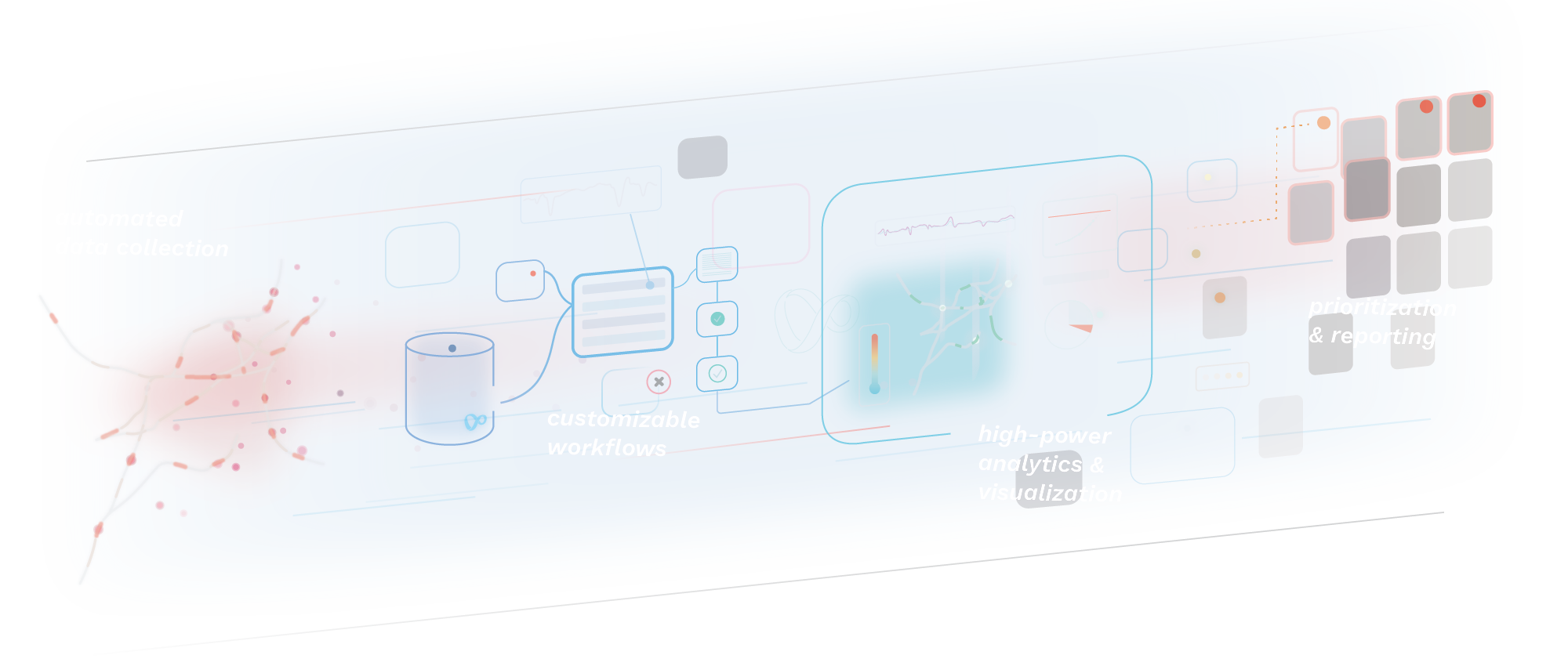
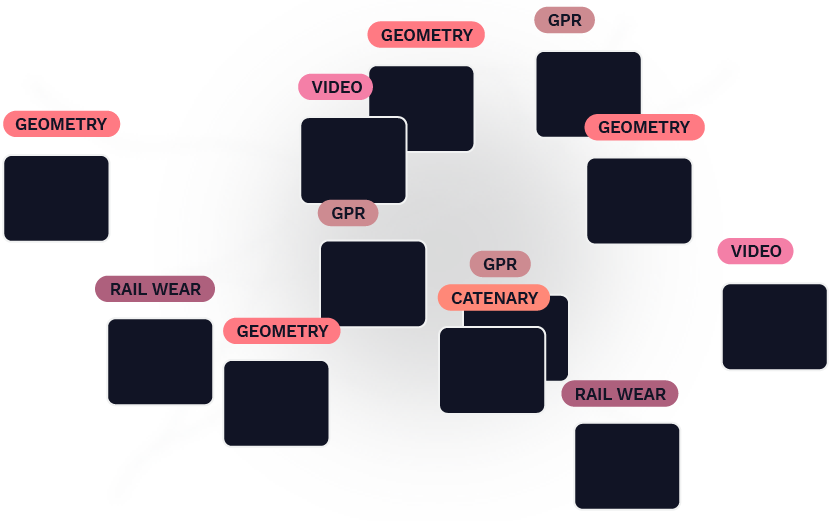
Rail profiles, track geometry, forward-facing video, tie inspections—you name it. As the number of sensors and formats increases, so does the need for tight structure and organization.

Graphic representing various kinds of data (Geometry, Profile, GPR, Video, Catenary) popping up all over a rail network, all mixed together

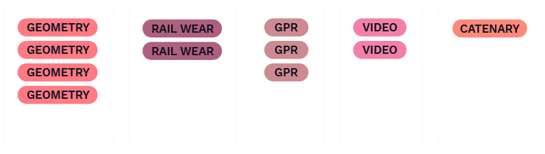
Our process begins with this wide variety of data formats and organizes them into a single data architecture.  In essence, this allows various data types to “talk” to each other, rather than being assessed individually.

Graphic representing various kinds of data (Geometry, Profile, GPR, Video, Catenary) organized by type

Condition Data Types

including
TRACK GEOMETRY
RAIL WEAR
Rail Profile
Rail Flaw
Forward Facing Video
Ground Penetrating Radar
Ballast Profile
Linescan Imagery
Drone Imagery
OHL Wire Wear
OHL Geometry
Pantograph Contact Forces
Tie Conditions
Component Inspection

Asset Types

including
Bridges
Tunnels
Signals
Culverts
Road Crossings
Switches
Curves
Tangents
Spirals
Wayside Devices
Stations
Retaining Walls
Rail TypeS
Tie TypeS
Tie Conditions
Track Class
Track Speed
Tonnage
Joint Bars
Insulated Joints
2
customizable
workflows

As part of the uploading process, plugin workflows automatically cleanse and sort data, label attributes, and detect changes. These workflows can be mixed and matched based on particular business needs or goals. For example, a plugin could be added to deal with particularly bad data or integrate weather-related information from an additional sensor.

Graphic showing many plugins chained together in a tree structure

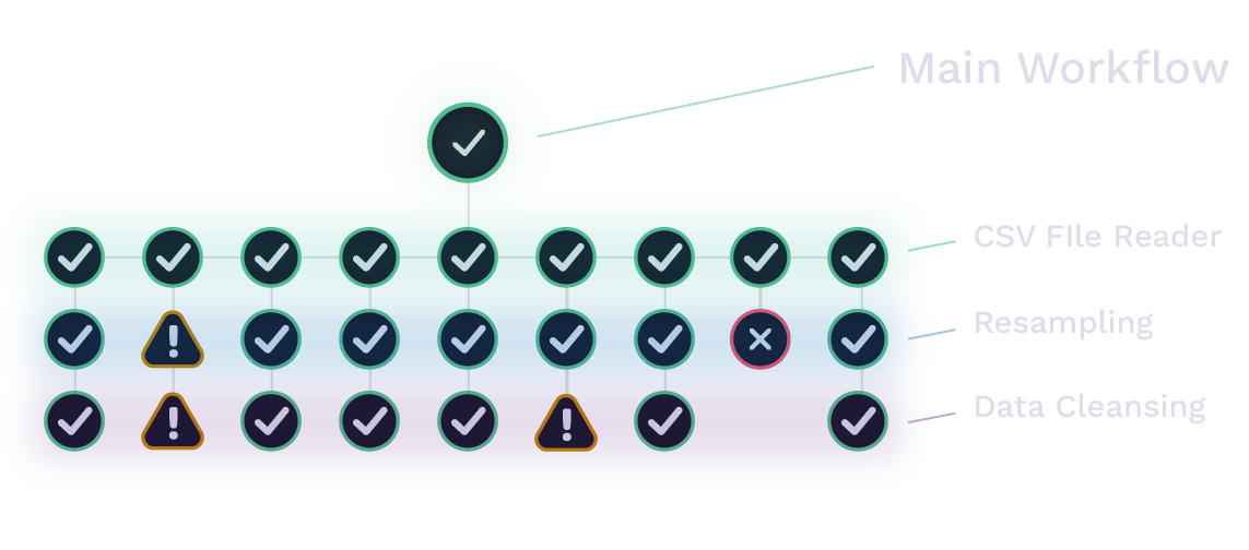
Plugins can be run on-demand, on a timed schedule, or triggered on a data ingestion event. Custom data formats can be handled with specialized plugins that allow nonstandard data to integrate with the rest of the system.

3
high-power
analytics &
visualization

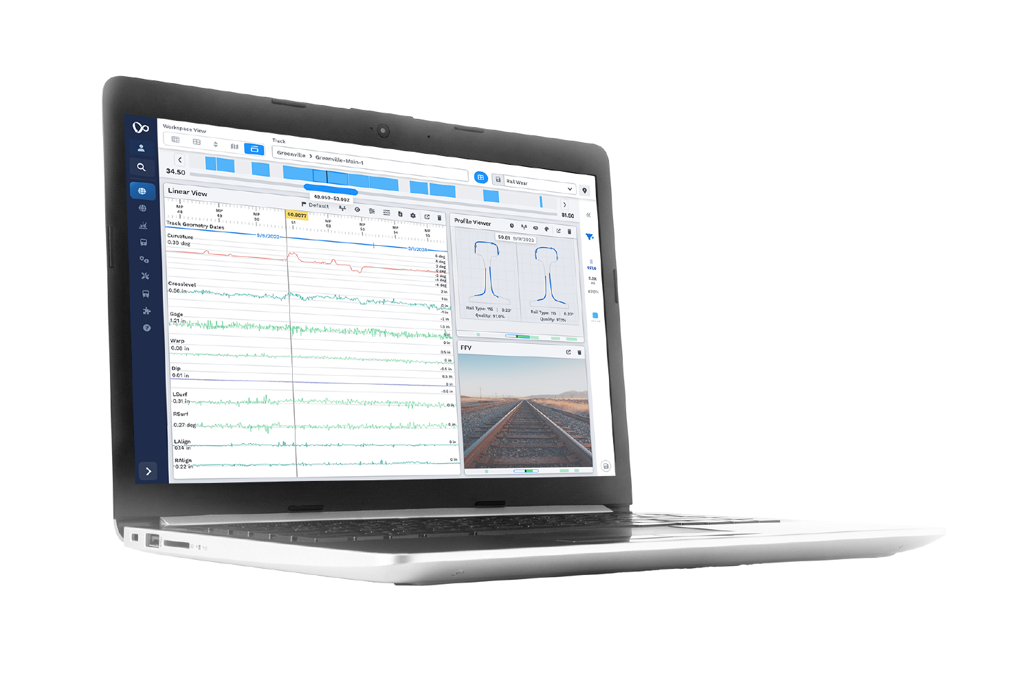
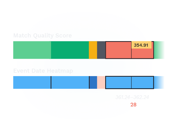
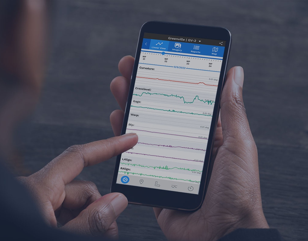
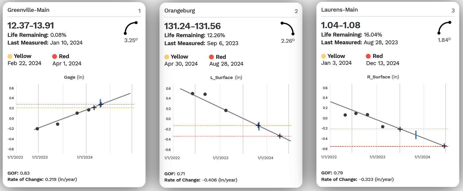
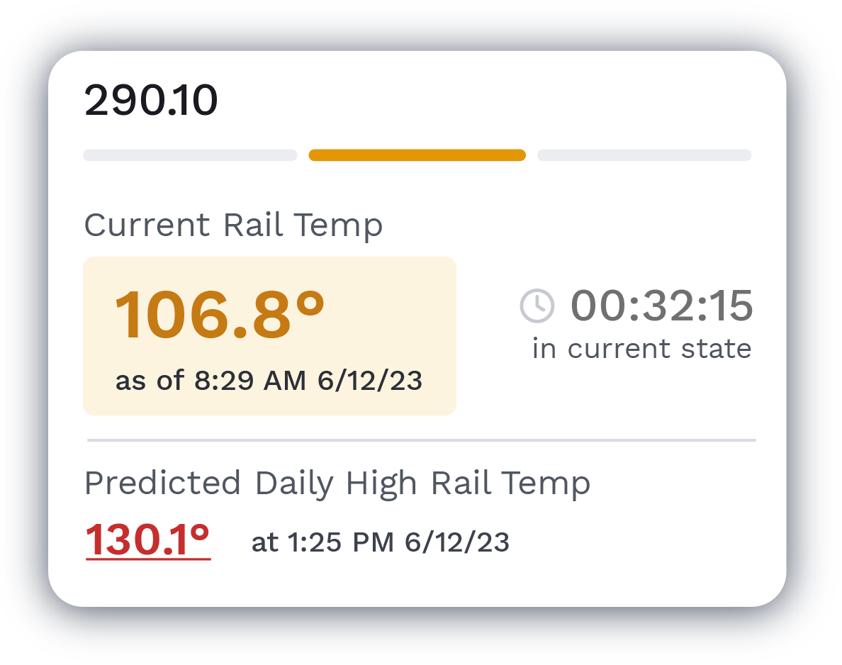
After the new data is fully processed, high-power analytics compare historical trends and visualize trendlines to identify the most urgent areas for maintenance. These visualizations are sent to Global Search and the RailLinks® Workspace, where they can be viewed alongside linear data channels and other data streams.

Graphic showing a simplified form of the VisioStack Workspace, with widgets containing linear data, profiles, and a map—all synchronized to a main slider at the top
4
prioritization
& reporting

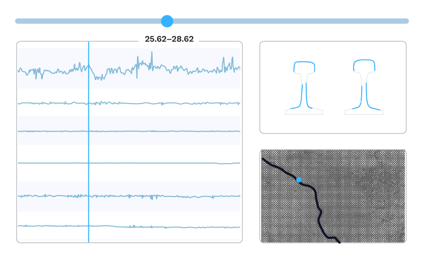
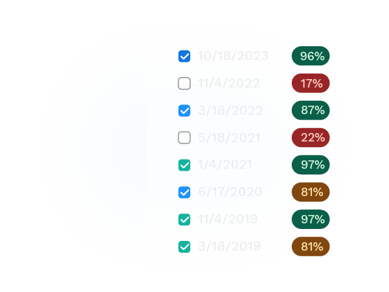
In Global Search, users can view and filter their processed data from across the entire network. Data which crosses critical thresholds can also be sent directly to maintenance personnel through notifications.


Visualizations

A first in the industry, the RailLinks Workspace brings together the various data streams—current and historical track geometry measurements, rail profiles, imagery, and a satellite map view—into a single interactive dashboard, offering a synchronized snapshot of any point on the track.
Laptop showing the RailLinks Workspace with several widgets
The Workspace can be configured for specific applications, like test car defect review, integrating multiple test data types to provide a holistic view of the problems identified. Linear data channels can be combined with the relevant image, profile, or map-based data for a given task. Strip charts can be customized with parameters, colors, sizes, and graph types.
Our focus on clear, innovative presentation runs beyond the Workspace throughout our platform. Strategic visualization helps important insights to pop out, rather than staying buried or being obscured.
The Map View in Global Search allows for detailed geographic display of rail type, defects, event history, and other asset information.
The Defect Validation app shows your requested number of previous data runs and highlights suspected anomalies, giving maximum context for efficient validation decisions.

Data Quality

The opposite of "garbage in, garbage out," having high-quality data leads to high-quality maintenance insights. That's why we check, highlight, and remove bad data at various points throughout our pipeline, both automatically and through quality control by our skilled data handlers.
Any data set not producing quality data, whether because of a malfunctioning sensor or because it can't be located against an asset, is a lost opportunity. Conversely, "junk" data can corrupt the good data around it, skewing predictions and bogging down the system.

RailLinks Infrastructure comes with multiple quality analysis processes to assess incoming measurements and flag data for review. These tools provide greater visibility into the data being collected across your assets, enabling you to identify and target outdated, inaccurate, or otherwise substandard data.
Graphic showing a trend line over points of several different colors. The blue points align closely with the trend line, while faraway red and yellow points are ignored.
Our trend calculator for rail wear looks for outliers and measurements matched to wrong rail profiles. Registering and highlighting suspected bad data points clarifies which trends are most reliable and most important.
Graphic showing a list of measurement dates with checkboxes and colored quality scores
When comparing historical profiles, quality scores allow you to take out low-quality measurements for a more accurate picture of rail degradation.
Graphic showing two color-coded bars. The top bar is labeled "Match Quality Score" and uses green, yellow, and red; the bottom on is labeled "Event Date Heatmap" and has chunks in various shades of blue, as well as a light red area.
Each track asset has a metric which displays the quality and coverage of its data and allows better or more current data to be substituted in.

Mobile Integration

Closeup of a man's hands using a phone, with a mockup of railway linear data displayed on the phone
The RailLinks® Mobile app rounds out the Infrastructure package with the ability to consume, edit, and input data on the go.

Combined with the ability to receive and share notifications of urgent conditions, this portability increases the effectiveness of both maintenance planners and field workers.
white chevron icon