
Rail Wear Maintenance
We hate to see these accidents because they’re preventable. If you’ve deployed measuring systems, you should know well ahead of time if the track is wearing out or gauge is increasing. But as it turns out, predictive asset maintenance is easy to get wrong. From bad measurement data to gaps in informing decision makers, you can measure regularly and still miss dangerous conditions.
Here’s how VisioStack delivers actionable reports to help you find troublesome spots in the rail ahead of time.
Keep Your Data Up-to-Date
If your measurement data is weeks or months out of date, you’re flying blind—you can’t react to emerging problems and you won’t be able to.
You want to be able to track your data as it’s ingested and processed and analytics pipeline. Without good visibility, it’s easy to import the same data twice or miss a data file. Even if you’re careful, things can go wrong! That’s why we provide real-time feedback on all the data we ingest.
Automatically Remove or Correct Bad Data
We usually find that clean data is more important than obscure mathematical wizardry. Machine learning doesn’t work unless the data it’s processing is correct—otherwise “garbage in, garbage out.” Much of the academic work in this space ignores this critical prerequisite.
But sometimes a measurement event is consistently wrong due to calibration errors. It’s running hot, recording biased data. While these kinds of errors tend to cancel out over time, they’re a big problem when you’re trying to understand the current state of your network—can you trust the numbers in front of you? We’ve invested heavily in understanding this problem and can often correct such errors automatically with enough data, but of course there’s no replacement for accurate measurements.

Align Data Across Time to Find Trends
Misaligned Data
This is the biggest challenge that we see. Sometimes measurement vehicles have inconsistent location information. Sometimes instruments drop data. Sometimes measurement vehicles back up and then move forward again! If you don’t account for these problems precisely, you can’t run meaningful models.
Understand Usage Patterns
If no trains run over your track next month, it won’t wear down. If usage triples, it will wear faster. To make a good model here, you need to integrate historical data, and you need to allow scenarios where you can project different amounts of usage.
Understand Track Repair Events
Repair work on the track can throw off trends. If you’re not careful, you (or your mathematical model) might confuse recent repair work with bad measurement data. Or you might think that a given part of the track wears out slowly because it was repaired during a measurement period. You need to understand the patterns that distinguish repair work from bad measurement data, and adjust automatically when a site is repaired.
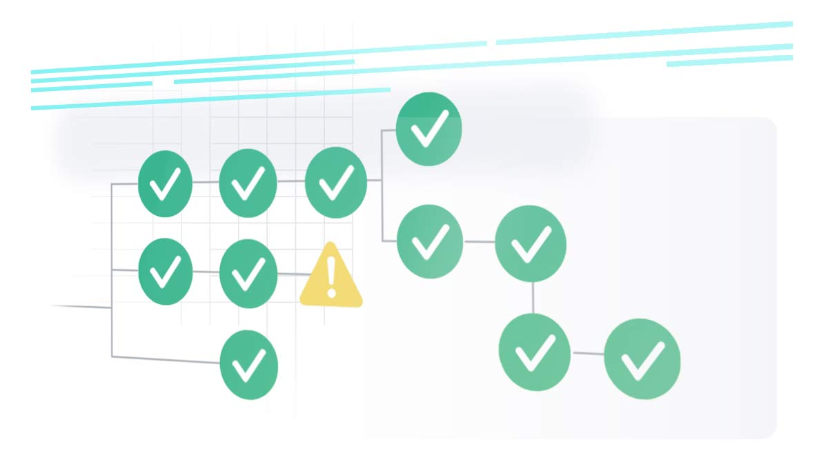
Actionable Reporting for Decision Makers

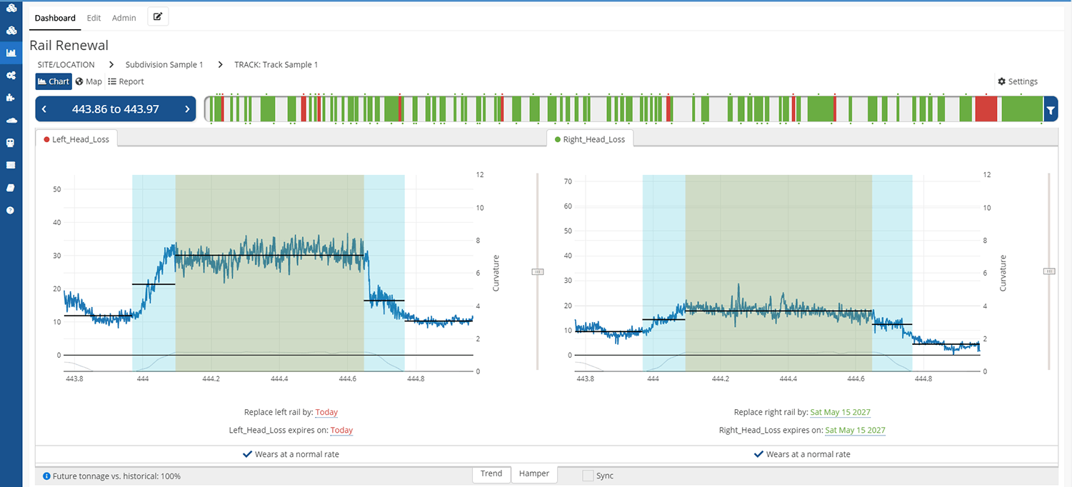
The system should meaningfully segment your track. Often you’ll want to replace the whole body of a curve, but sometimes just half the curve needs to be reviewed because the other half was repaired last year. At the same time, the system should sensibly merge different repair regions if they’re close together. Oh, and if part of the same track fails this year, and another part fails in two years? You want a report that thinks like you do.
You should be able to flexibly set tolerances. Regulations mean that sometimes sharp curves have different wear thresholds than slight curves. Different rail weights can have different tolerances, too. You need to be able to mix and match these rules so that the system understands the actual decision making process.
The system should be completely configurable. You’re a power user! Maybe you want to up the projected usage next year, or tweak the rules for what counts as replaceable. Or maybe you just want to adjust some filters so you can take a great screenshot. Go wild.
And . . . you should be able to easily see actual wear data if you want to in order to validate the system’s verdict. At the end of the day, summaries can be wrong. If you can see the data for yourself, and compare it with historical measurements, you don’t have to trust the computer. (But we strongly believe in giving you reasons to trust the system . . . it’s a lot faster that way.)
Scale it with the Cloud
We’ve seen lots of organizations try to roll their own infrastructure in this area, but it almost always ends poorly. Perhaps you planned for 100 giga-chunks of work, but your new data system is now giving you 500 giga-chunks, and your system has slowed to a crawl. Thanks to our state-of-the-art cloud integration, we can spin up hundreds or thousands of cores automatically to quickly process data in parallel.
But it’s not all challenges! There’s also lots of opportunities from comparing data across your entire network. It’s a lot easier to find a signal from the noise when you can compare all your wear data at similar locations. You can even discover facts like “this subdivision is wearing down 50% faster than a typical subdivision in our network.” And when you start asking questions armed with this kind of data, you’re truly on the path to preventative maintenance. Fix it early.


